|
 |
|
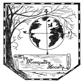
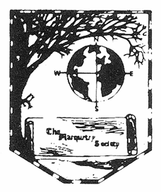
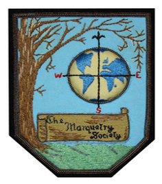
Up until 1963 the Marquetry Society didn't actually have an official logo, or Insignia as they preferred to call it then. The previous ten years of the Society's existence saw a procession of headings to designate the Marquetry Society, but there was no emblem to represent us, only a text or worded heading. So it was, that in the early months of 1963 the Executive Committee decided to launch a competition to design an "insignia" which was to be adopted as the official emblem or logo of the Marquetry Society. In this article you will see the progression of the winning design into the emblem/badge/logo of the Marquetry Society that we all know and love today! So, let's start with the article from issue 45 of the Marquetarian that introduced us to the winning design: INSIGNIA DESIGN COMPETITION The cover of this Marquetarian magazine shows a replica of the Society's new insignia. The badge was chosen as the winning design from those submitted for the "Insignia Design Competition" and was judged at the Society's Executive Meeting held on October 6th, 1963. The judging was carried out by a panel of seven, representing Groups throughout the country. After much deliberation the design selected as being most suitable for use by the Society was the one submitted by Mrs. S. Kinder. We congratulate Mrs. Kinder on her achievement. Here is an explanation of the design. The Tree represents the basic materials used by Marquetarians. Its branches embrace the world to indicate international membership of the Marquetry Society, and also all the different woods used by the Marquetarians, which come from nearly every country in the world. The English landscape represents the country of origin of the Marquetry Society and the whole design is bordered by a type of Stringer used by Marquetarians. Our congratulations to Mr. Searle, the runner-up in the competition. Well, there you have the explanation of the origins of the design, so, lets not waste any more time in bringing you the design in all its progressions up to the present day:
|
